

Behind the Design: Rushfaster Pencil Case
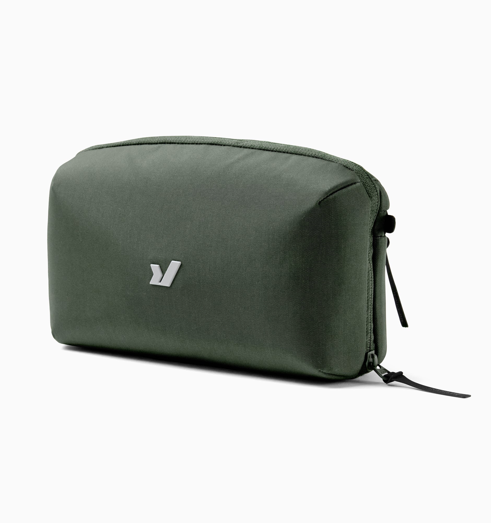
At first glance, it appears to be just a pencil case. But for us at Rushfaster, it represents something much more—a condensed expression of how we think about design: simple, adaptable, and frictionless.
In this Behind the Design, our Product Design Director, Hadrien Monloup, reflects on how the pencil case came to life, and why it still sits on his desk as a daily reminder of what good product design should feel like.
The pencil case may be minimal, but it reflects a deliberate design philosophy at Rushfaster: reduce friction, remove unnecessary structure, and design for real behaviour—not idealised organisation systems. It’s not minimalism for aesthetics. It’s essentialism for function.
As Hadrien notes, the goal was to create something that stays intuitive in everyday use without adding cognitive load.
Rethinking the Traditional Pencil Case
Most pencil cases tend to fall into two extremes:
- A simple pouch where everything gets dumped into one space
- Or a highly structured organiser with fixed slots for each pen or item
Both approaches have trade-offs. One creates chaos. The other creates rigidity. Overly structured systems often become directive—you spend more time maintaining them than actually using them.
From a design perspective, the challenge was to move away from prescription and build something more intuitive in how it’s used day to day.
Two Zones, One Intuitive Interaction
The solution came from observing how people actually use their gear. Most people only rely on a few key items regularly, while everything else is occasional.
So the pencil case introduces a simple structure:
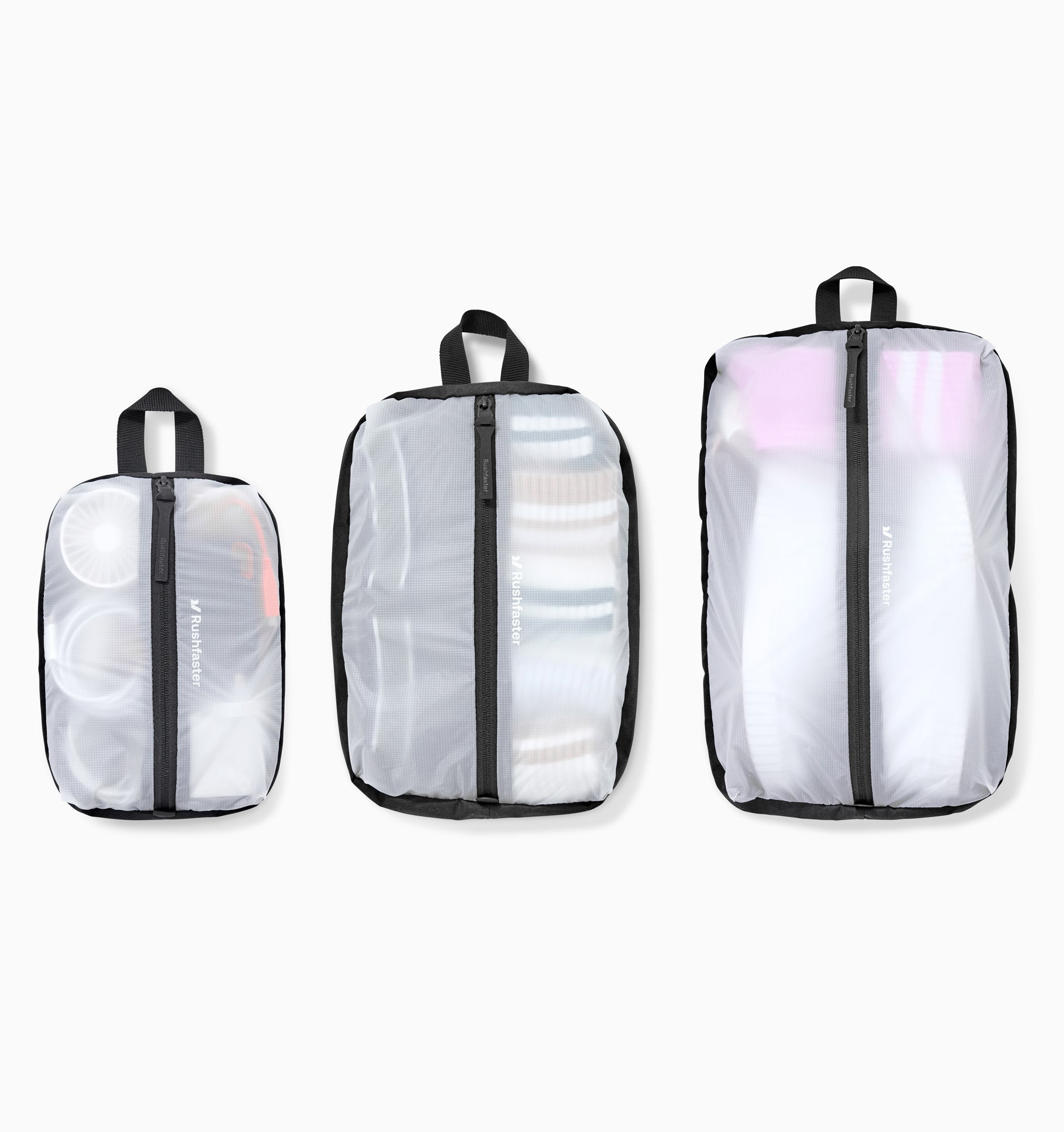
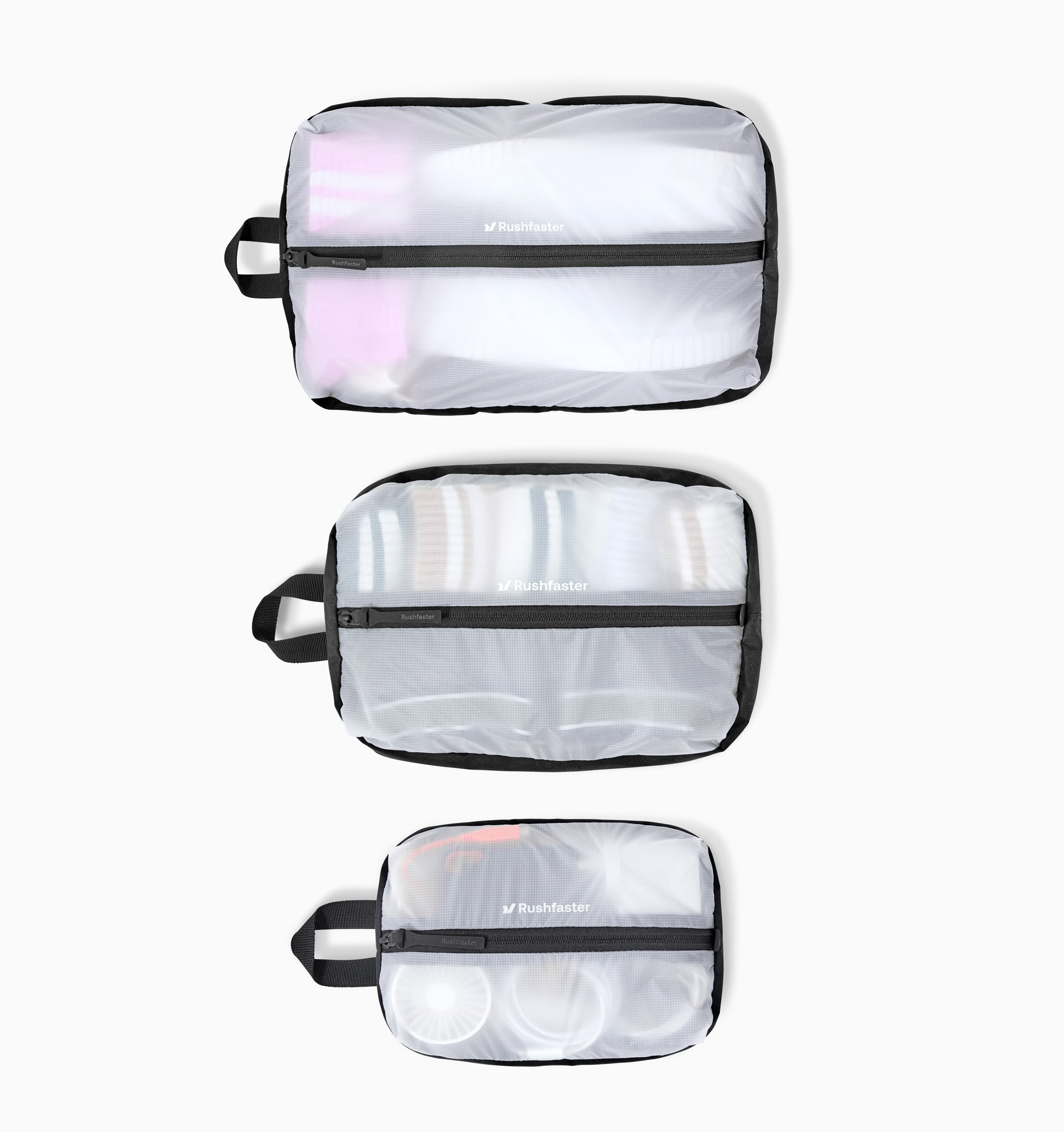
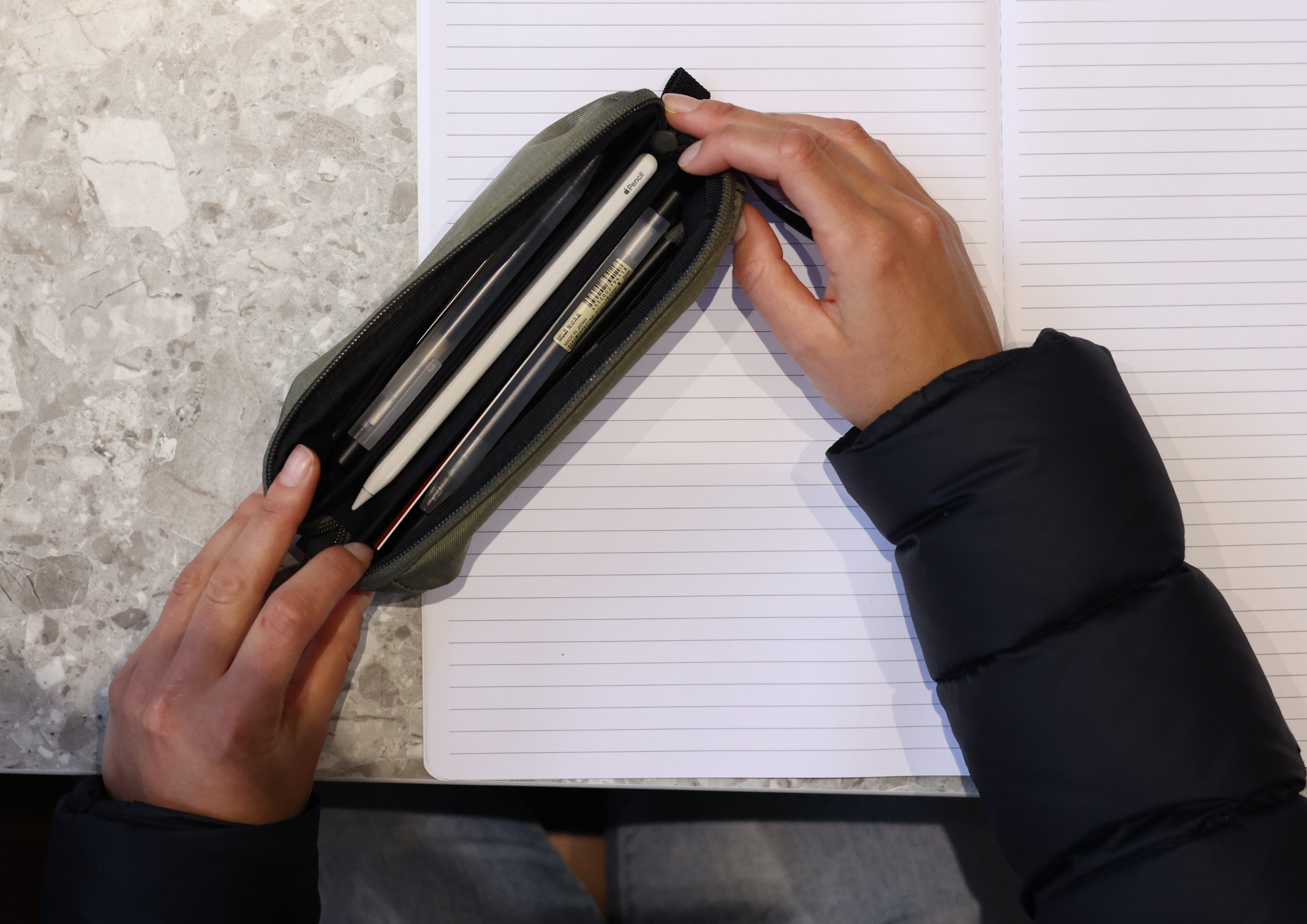
- Centre tray: for the things used all the time
- Side compartments: for everything else
As Hadrien explains, the intention was to create a layout that naturally guides behaviour when opened—without requiring sorting systems or maintenance. Use it. Close it. Move on.
When you open the case, everything falls into place intuitively, without needing to think it through.
Designed to Adapt, Not Dictate
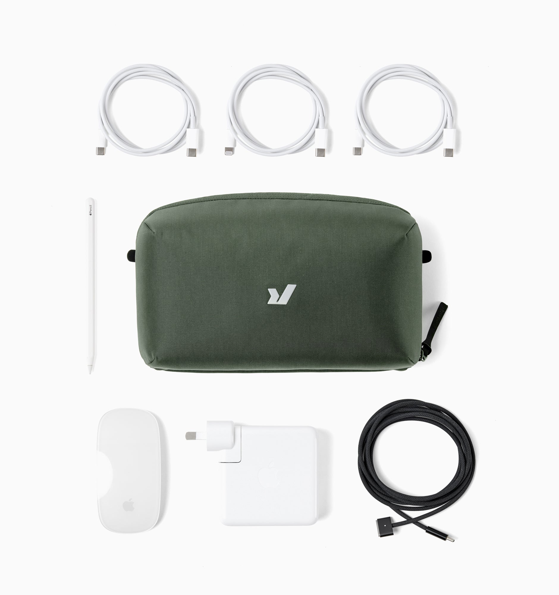
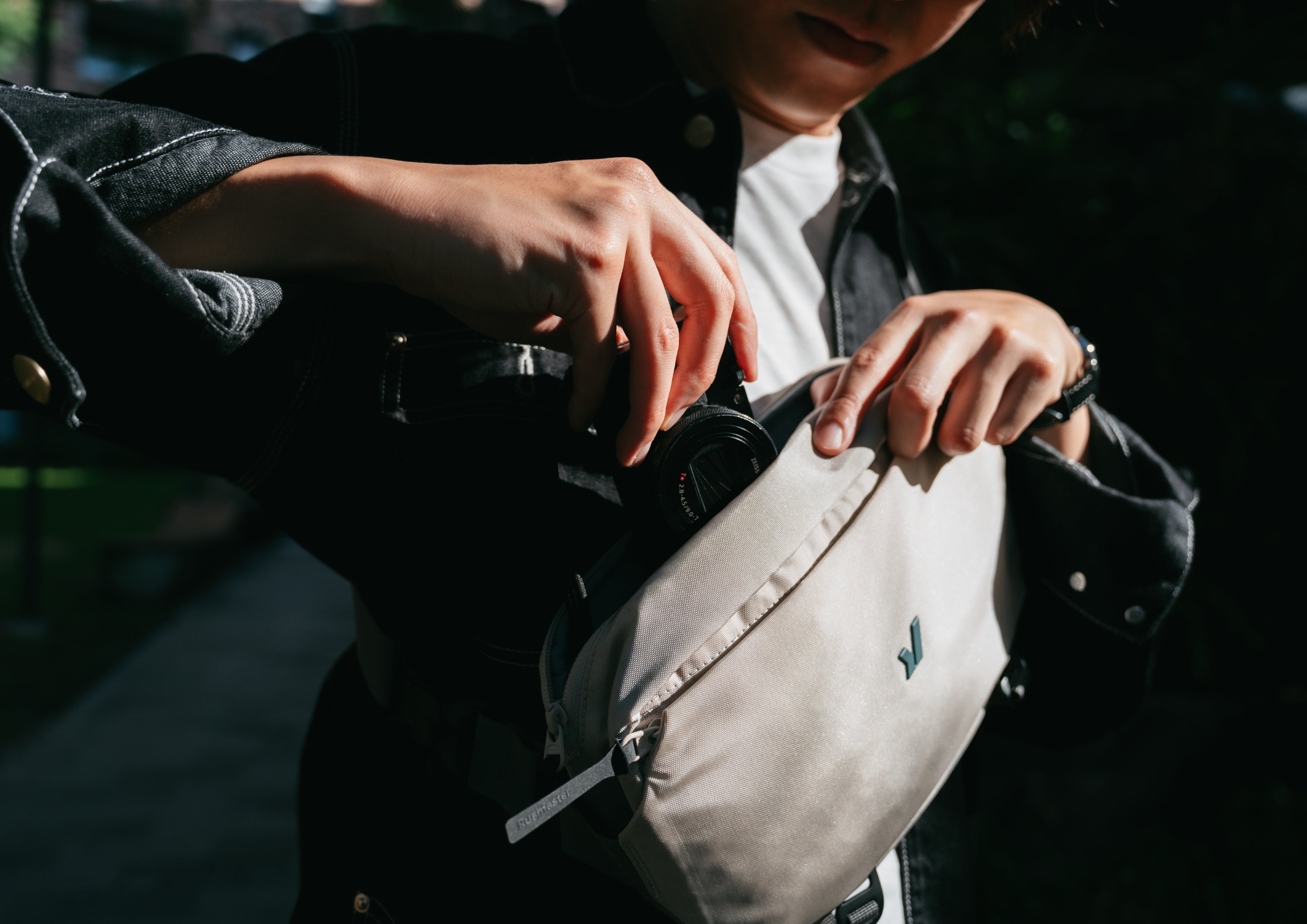
A core idea behind the design is adaptability. One week it might carry pens and markers. The next, charging cables and small tech accessories. Another time, it might support a travel setup with a GoPro and essentials.
“It’s not about what it holds,” Hadrien says, “it’s about how consistently the structure works across different uses.”
The principle remains the same: centre what you use most, and keep everything else accessible but secondary. The design is built so it can move seamlessly into different contexts without needing to change how you interact with it.
The Idea of “Disappearing”
Another key design intent is what we call “disappearance”. When the side compartments aren’t needed, the product doesn’t feel bulky or overbuilt. It compresses into something compact and unobtrusive.
When needed, it expands just enough to be useful—without becoming cluttered or rigid. This balance allows it to sit quietly on a desk or disappear into a bag without demanding attention.
It’s designed to disappear into your routine rather than stand out in it.
Materials That Do the Work Quietly
Material choice plays a critical role in how the product feels and performs. The Rushfaster Pencil Case uses durable, lightweight, water-resistant materials, including bluesign approved recycled fabrics wherever possible.
Hadrien’s input focused on how materials behave in real-world use, not just how they look on paper.
Fabric selection considers:
- Weave tightness for durability and water resistance
- Yarn quality for abrasion and strength
- Backing for structural integrity
- Visual balance (not too shiny, not too matte)
- And critically—drape
Drape determines how the product behaves in real life. Too structured, and it becomes rigid and boxy. Too soft, and it loses function. The goal is balance.
The result is a material system that feels considered rather than forced.
Compact by Design
A key influence on the design came from a previous pencil case Hadrien used years ago—small, flexible, and surprisingly capable. It often carried more than expected, not because it was designed for it, but because it adapted.
That idea helped shape the final direction: a product that stays compact, flexible, and easy to live with. It doesn’t demand space and fits naturally into cafés, backpacks, and everyday routines.
It can sit on a small desk, slide into a bag, and move through the day without getting in the way.
Simplicity That Still Feels Intentional
At its core, the design is about reducing cognitive load. Open it. Access what you need. Close it. Done. No system to maintain. No overthinking. No interruption to flow.
“It’s very simple and intuitive,” Hadrien notes, “but there’s rational behind it.”
That combination—clarity supported by intention—is what gives the product its sense of ease.
A Design Reminder on the Desk
For us at Rushfaster, the pencil case is more than a product. It’s a reference point.
As Hadrien keeps it on his desk during design work, it serves as a reminder of what we aim for: simplicity that works, adaptability that feels natural, and design that gets out of the way.
Because for us, good design isn’t about adding more. It’s about removing everything that doesn’t need to be there.
Leave a comment
This site is protected by hCaptcha and the hCaptcha Privacy Policy and Terms of Service apply.